Dear reader,
Thank you for joining us once again for another Devlog of Code 7 and we apologise for being so quiet in the last couple of months. A lot has happened after founding Goodwolf Studio... we have now our own little office! We've been exhibiting the game at Quo Vadis in Berlin and plan to show a new prototype at Gamescom in Cologne, this summer.
 |
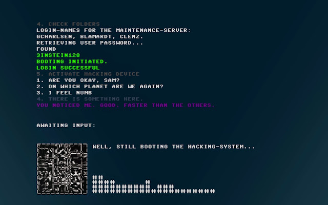
| Screenshot from the original Prologue |
In the last month we have cracked our head over the visual style of the game. We liked the grungy, retro DOS-ish look of the prolog but had some critical questions:
- does this style allow more complex gameplay?
- do still images of this style look like an appealing game?
- is this style compatible with diverse animation and effects?
We came to the conclusion that it might be a better idea to move in a more futuristic direction and started researching interface designs from other games and movies. We worried about the screenshots of the game might look to "boring" to capture a persons attention and make them want to try the game. We thought a more modern and fancy look will be a better eye-catcher.
Take a look at our Pinterest board to see what inspired us.
Take a look at our Pinterest board to see what inspired us.
We wanted to try something similar for Code 7 and make it feel more like a sci-fi movie. Here is a mockup of what we thought was a good direction:
 |
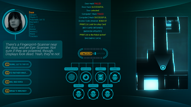
| First mockup of the sci-fi look |
You can see a more modern font, the minimal but futuristic map, even an inventory system (which we kinda dumped again...). But the visual step was too small. If we wanted to make it more futuristic then we had to really make it more futuristic. Trying to let go of the original interface composition we tried something completely new: putting the input into the center.
 |
| Second mockup of the sci-fi look |
 |
| How the new input looked in action |
 |
| some variations of the input field |
We experimented a lot, tried rearranging aspects of the interface to give them all their own relevance and importance. We tried colours, different animations, rotations and more. A major change was the icons at the bottom. Every element that you can interact with appears as an icon in the bottom, because we wanted to avoid the guessing game some players had to do in order to advance. We think typing in single letters until a command pops up in the auto-complete row is now a good game experience and doesn't feel very rewarding, even if you manage to solve the puzzle. That is why we decided to show intractable objects directly and make the puzzle about the context of those objects. When do I use this? How could I combine this with other objects? You see, that visual design also intertwines with game design? It all is connected.
We showed people the new designs and explained them, showed them mockup videos and game ideas and the result was almost always the same:
Even with all the sparkling new, animated, Minority Report-ish visuals, they liked the old one better. They liked the retro feeling, they liked the DOS look, they liked the hacker-feeling it put in them.
Player feedback is very important to us and we thought a lot about what each and everyone of them said. Then, on the Quo Vadis Conference fellow indiedevs from Monokel (check out their "Shadow of Steam", it looks awesome!) gave us feedback which was the straw that broke the camels back... we had to take a step backwards to move forward!
This doesn't mean we dumped everything new into the trash, we kept some things. But we went back to the classic retro look and it just felt right. This was what Code 7 is suppose to feel like. It was like coming home from a trip. We kept the map, the icon-list of the usable commands and moved the dialog output to the upper part. Take a look at the current state below but please note that this is a work-in-progress glimpse, which is missing effects, sounds and most importantly voice-over (we are rewriting the Prolog right now).
We are still experimenting with a few things and nothing is completely set in stone. We plan to have the new version running by this summer. Make sure to sign up for our newsletter below to get informed about beta-testings and other events.
What do you think about the "new" old design? What do you like? What do you dislike? Feel free to be honest and give us your feedback. We appreciate it!
Follow us on Twitter
Follow us on Facebook
We showed people the new designs and explained them, showed them mockup videos and game ideas and the result was almost always the same:
They all liked the old design better.
Player feedback is very important to us and we thought a lot about what each and everyone of them said. Then, on the Quo Vadis Conference fellow indiedevs from Monokel (check out their "Shadow of Steam", it looks awesome!) gave us feedback which was the straw that broke the camels back... we had to take a step backwards to move forward!
This doesn't mean we dumped everything new into the trash, we kept some things. But we went back to the classic retro look and it just felt right. This was what Code 7 is suppose to feel like. It was like coming home from a trip. We kept the map, the icon-list of the usable commands and moved the dialog output to the upper part. Take a look at the current state below but please note that this is a work-in-progress glimpse, which is missing effects, sounds and most importantly voice-over (we are rewriting the Prolog right now).
 |
| example of the current map system |
We are still experimenting with a few things and nothing is completely set in stone. We plan to have the new version running by this summer. Make sure to sign up for our newsletter below to get informed about beta-testings and other events.
What do you think about the "new" old design? What do you like? What do you dislike? Feel free to be honest and give us your feedback. We appreciate it!
Follow us on Twitter
Follow us on Facebook

Keine Kommentare:
Kommentar veröffentlichen